Black Cloister Brewing Company
Beer Can Design
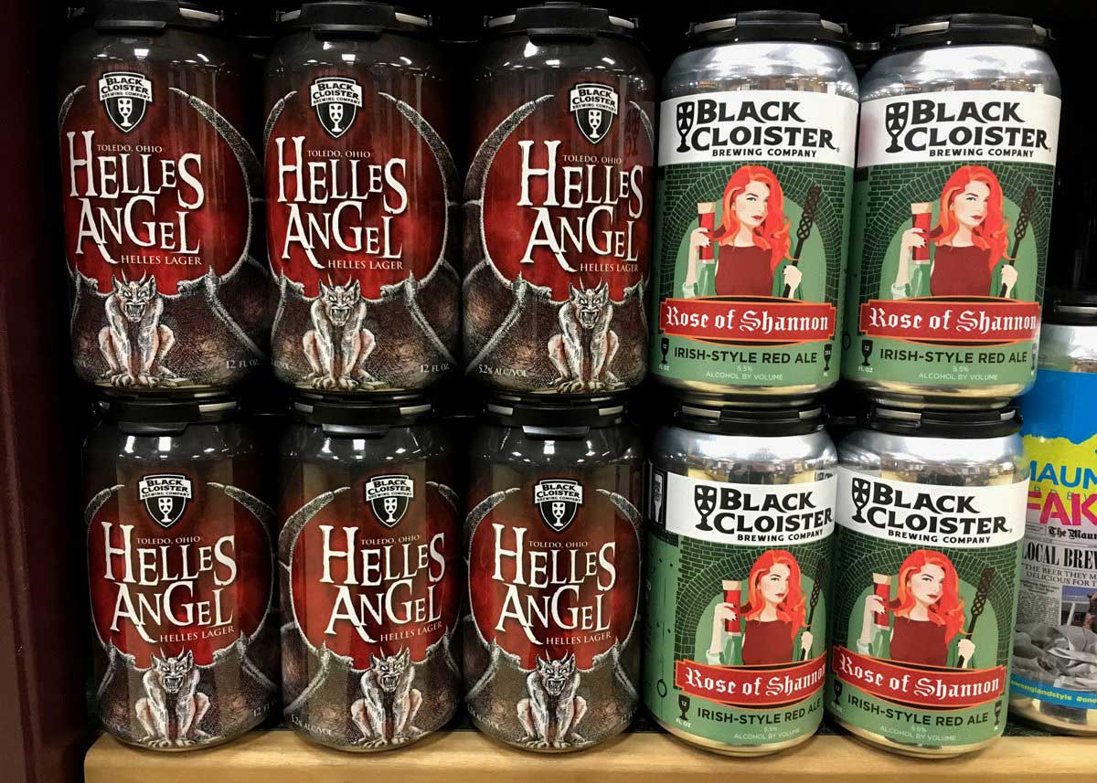
Black Cloister Brewing Company, located in Toledo, OH, needed a cohesive can design strategy created so that their beer would stand out as distinctly their own, while still maintaining each can’s uniqueness. The Black Cloister brand is reminiscent of the Protestant Reformation in Europe. You’ll see many of their beers bear similar names to biblical characters such as “Black Madonna,” “Mighty Samson” and “Mary Mangolene.”
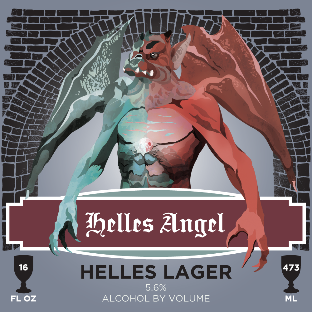
To Helles And Back
Wier & Bein was tasked to create a can design for two of their beers: the Rose of Shannon, a seasonal Irish Red Ale, and Helles Angel, their year-round lager.
A little background for ya: “Rose of Shannon” is a play on the biblical reference “Rose of Sharon” and their past brewer Shannon. They needed a design that would fuse the two concepts together seamlessly while creating an updated look and feel to the label.
In regards to Helles Angels, Helles is German for light and Lucifer is known as the angel of light. Our goal was to use the contrast of darkness and light found in the beer’s name and tie it into the gothic-style gargoyle that stood watch on their previous label.
Everything's Coming Up Roses
Through a few different design iterations, we were able to come up with a solution that aligned with the internal vision Black Cloister had for their cans. The new labels gave their logo more prominence, brought in the brick archways present at their location, and showcased their name on an illustration of the Wittenberg Castle church where the 95 Theses by Martin Luther was nailed in 1517. In addition, the two can designs, though quite different, still had a similar style to create that brand consistency the client was looking for initially.